
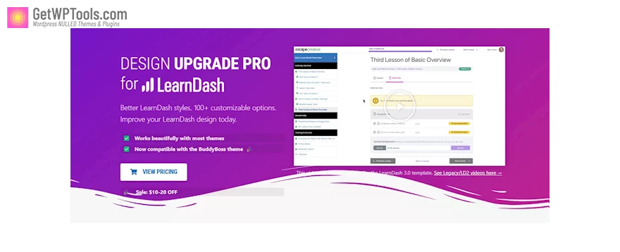
Ideal for most themes, Design Upgrade Pro for LearnDash is now seamlessly compatible with the BuddyBoss theme.
Unlock Better LearnDash styles with over 100 custom options using Design Upgrade Pro. Elevate your LearnDash design today, as the enhanced LearnDash CSS seamlessly integrates with your theme.
Design Upgrade Features:
- Progress Bar
- Bar color
- Round or square edges
- Striped or solid color design
- Bar height
- Container color
- Smooth animation on page load
- Hide “X/Y steps”
- Hide “% Complete”
- Achievements Add-On
- Unique title & message colors/font size
- Popup border & shadow
- Hide icons in the popup
- Popup position
- Custom icon size for My Achievements
- Course Grid Add-On
- Grid Item Hover Effects: Shadow, lift & enlarge
- Grid Items: Box shadow
- Ribbon background & text colors: Default, enrolled, free & custom ribbons
- Category Dropdown Selector: Width, background, border radius & padding
- Grid Items: Border width, color & radius
- Equal height columns (automatically applied)
- Focus Mode
- Edge-to-edge content width (for page builders)
- Content background color
- Hide breadcrumbs
- Hide bottom buttons
- Hide the “back to course” link
- Avatar Style: circle or square
- Hide page title
- Header: Custom user display name
- Header: Hide avatar
- Header: Hide name
- Animate content on page load
- Sidebar: Background color
- Course Heading: Background color
- Course Heading: Text color
- Dropdown Menu: Background & text colors
- Course Navigation
- Topic/Quiz indentation
- Text Color
- Hover: text & background color
- Add a strikethrough to completed items
- Lesson text, border & background colors
- Section text & background colors
- Auto-expand all topics & quizzes
- Remove (or customize) topic line separators
- Login/Registration
- Close icon color
- Login panel background, text & heading colors
- Register panel background, text & heading colors
- Popup modal border width & color
- Login & Register form styles
- Login Panel: Remove logo & description text
- Overlay color & opacity
- Register Panel: Remove description & email confirmation text
- Group Course Lists
- Disable “expand/collapse”
- LearnDash Profile
- Hide the “Edit Profile” link
- Your Courses: Disable “expand/collapse”
- Disable Search
- Hide Sections: user info, statistics, your courses
- Custom URL for “Edit Profile” link
- Summary: background & text colors
- Summary layout: stacked or horizontal
- Stats layout: stacked or horizontal
- Square, circular, or rounded avatar
- Hide avatar
- Hide each statistic
- Hide quizzes, essays, and/or assignments (within the “Your Courses” area)
- Custom avatar size
- Design Upgrade Pro General Design
- Correct/Complete color (for icons & completion status)
- Alerts: Background, text & icon colors
- Link & link hover color
- Global border-radius
- Alerts: Small or large size
- Alerts: Hide icons
- Buttons
- Secondary button color & text
- Primary button color & text
- Hover styles for both primary & secondary buttons
- Choose a global button border-radius
- Tooltips
- Text Color
- Border radius inherits global setting
- Background color
- Course Page
- Status: Hide individual columns (status, price & action)
- Status: Background & text color
- Status: Hide column labels
- Status: Border width & color
- Course Content Lists
- “Course Content” header background
- Hide the “Course Content” header
- Add a boxed container
- Set container background & border styles
- Rounded or square edges (inherits global border-radius)
- “Course Content” header text color
- Highlight rows on hover
- Disable “expand/collapse”
- Section background & text colors
- Remove the “Lesson Content” header
- Topic line separator color
- Indent topics
- “Lesson Content” header background & text colors


